Sample card title
Sample body text shows how the component looks with a typical amount of copy.
The complete component gallery for the Preston Trail Ward website. Every button, banner, card, hero, list, and badge on the site, each shown at desktop and mobile sizes. Components here reuse the exact same classes as the live pages, so this page can never drift from the site.
Every configurable component can be dropped into a markdown page as a {{name key="value"}} directive. build.py expands it into the canonical markup. Buttons use the "Label|/url" spec; tertiary links use "Label|/url; Label|/url". The dark flag can be bare ({{contact-card ... dark}}) or dark="true". Omit a parameter to take its default. Unknown directive names pass through untouched.
{{card title="Sample card title" body="Sample body text."
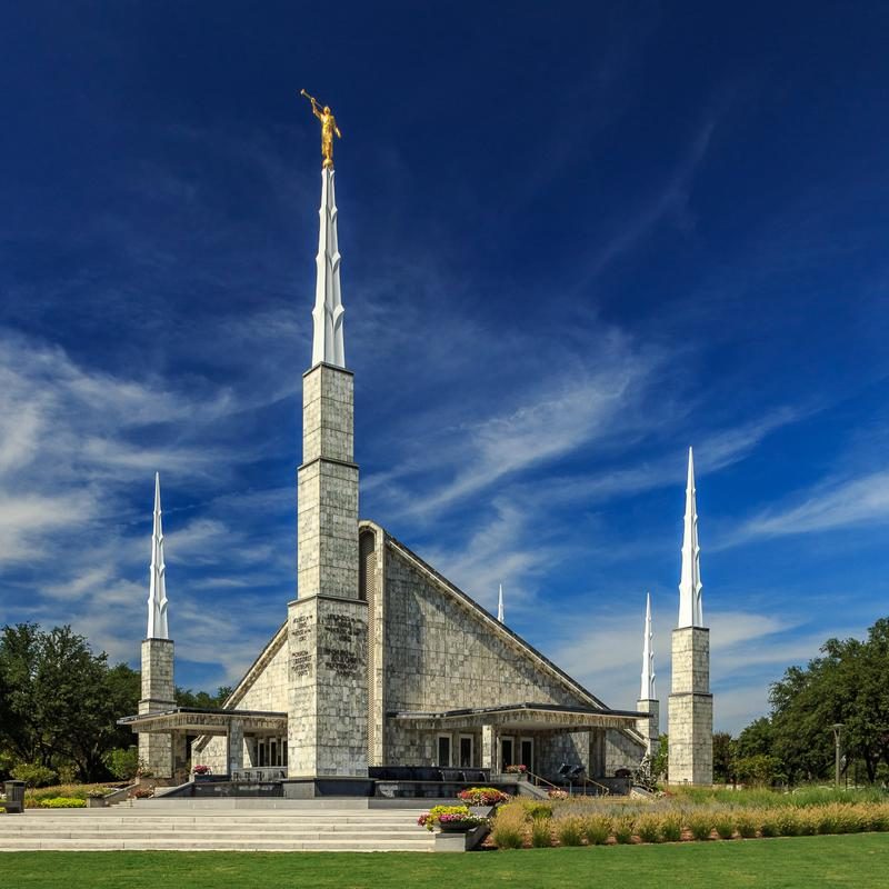
       image="/assets/img/dallas-temple.jpg"
       primary="Primary action|/visit-us"
       secondary="Secondary action|/events"}}
The single source of truth. Every component below is built from these variables, so a palette or spacing change lands everywhere at once.
Body copy reads like this. Warm and natural, never flowery.
Lede paragraph on a dark hero.
Kicker label
| Token | Value | Use |
|---|---|---|
--space-xs | 0.5rem | Tight gaps |
--space-sm | 0.75rem | Card gaps |
--space-md | 1rem | Default gap |
--space-lg | 1.5rem | Section gaps |
--space-xl | 2.5rem | Large gaps |
--space-2xl | 3.5rem | Section padding |
--radius-sm | 10px | Small controls |
--radius | 14px | Cards, panels |
--radius-pill | 999px | Buttons, badges |
--shadow | layered soft | Cards, panels |
--maxw | 1120px | Page container |
--maxw-prose | 46rem | Reading column |
Three-tier hierarchy. .btn-primary (solid sky) is the single most important action per card or section. The ghost button has two canonical forms: .btn-ghost for dark backgrounds and .btn-on-light for light ones. Buttons can carry an inline SVG icon with .btn-icon (1.15em, aligned to the label), as on scheduling buttons. Two equal CTAs split 50/50 with .duo-btns and are never stacked. A lone card CTA goes full-width on mobile. Tertiary actions are quiet text links (.card-links), never buttons. Components emit buttons through their parameters; authors never hand-write button markup.
The same buttons on midnight. .btn-outline-light is the compact outline for dark bands.
The simplest card. The lone CTA goes full-width on mobile.
Parameters
| Parameter | Type | Default | Description |
|---|---|---|---|
kicker | string | "" | Small uppercase label above the title. |
title | string | "" | Card heading. |
body | string | "" | Body copy. |
image | URL | "" | Optional 16:9 header image. |
image_alt | string | title | Image alt text. Defaults to the title. |
primary | "Label|URL" | none | Main button (solid sky). |
secondary | "Label|URL" | none | Supporting button (outline). Two buttons split 50/50. |
links | "Label|URL; ..." | none | Tertiary quiet links below the buttons. |
card_url | URL | "" | Whole-card tap target (uses the primary button destination). |
variant | ""/"horizontal" | "" | Horizontal layout: image left, content right on desktop. |
Directive
{{card kicker="Sample label" title="Sample card title"
       body="Sample body text shows how the component looks."
       image="/assets/img/dallas-temple.jpg"
       primary="Primary action|#"
       secondary="Secondary action|#"
       links="Quiet link one|#; Quiet link two|#"
       variant="horizontal"}}
Desktop
Sample body text shows how the component looks with a typical amount of copy.
Mobile
Sample body text shows how the component looks with a typical amount of copy.
Image header with a kicker label, one primary button, and quiet tertiary links below it.
Desktop
Sample label
Sample body text shows how the component looks with a typical amount of copy.
Mobile
Sample label
Sample body text shows how the component looks with a typical amount of copy.
variant="horizontal": image left, content right on desktop; stacks like a normal card on mobile. Two equal CTAs split 50/50.
Desktop
Sample body text shows how the component looks with a typical amount of copy.
Mobile
Sample body text shows how the component looks with a typical amount of copy.
Midnight strip with white copy and a dark contact card or buttons. The secondary button uses the ghost-on-dark form.
Parameters
| Parameter | Type | Default | Description |
|---|---|---|---|
title | string | "" | Bold lead-in of the banner copy. |
body | string | "" | Banner copy. |
dark | "true"/"false" | "true" | Midnight strip or light card. |
primary | "Label|URL" | none | Main button. |
secondary | "Label|URL" | none | Supporting button. |
Directive
{{banner title="Sample banner title"
         body="Sample banner copy with one bold lead-in."
         dark="true"
         primary="Primary action|#"
         secondary="Secondary action|#"}}
Desktop
Mobile
dark="false" renders the white-card variant for light pages.
Desktop
Mobile
Midnight band. Dark bands break up the page rhythm; never put two light alt sections back to back.
Parameters
| Parameter | Type | Default | Description |
|---|---|---|---|
kicker | string | "" | Pill label above the title. |
title | string | "" | Band heading. |
body | string | "" | Band copy. |
primary | "Label|URL" | none | The band's single button. |
dark | "true"/"false" | "true" | Midnight band or light band. |
Directive
{{band kicker="Sample kicker" title="Sample band title"
       body="Sample band copy."
       primary="Primary action|#"
       dark="true"}}
Desktop
Sample kicker
Sample band copy.
Mobile
Sample kicker
Sample band copy.
dark="false" renders the light variant with hairline rules top and bottom.
Desktop
Sample kicker
Sample band copy.
Mobile
Sample kicker
Sample band copy.
The default layout="grid": channel columns on desktop, stacked on mobile. Phone numbers display formatted, e.g. (555) 123-4567.
Parameters
| Parameter | Type | Default | Description |
|---|---|---|---|
name | string | required | Person or group name. Never bolded. |
tel | phone | none | Renders Call (tel:) and Text (sms:) channels. Shown formatted, e.g. (972) 322-5863. |
email | address | none | Renders the Email (mailto:) channel. |
schedule | "Label|URL; ..." | none | Renders Schedule channels with calendar icons, one per entry. Label shows as the channel value, e.g. a person's name; the link opens the scheduling page. |
layout | "grid"/"list"/"inline" | "grid" | Grid: channel columns on desktop, stacked on mobile. List: compact rows with chevrons. Inline: concise name plus action pills in one row, no values. |
dark | flag | light | Dark variant for dark backgrounds. |
Directive
{{contact-card name="Sample Name"
               tel="+15551234567"
               email="[email protected]"
               layout="grid" dark}}
Desktop
Mobile
.contact-card--dark for dark banners, bands, and panels. Sky-bright icons and dividers on midnight.
Desktop
Mobile
Phone present but no email renders Call and Text only. Email only renders the Email channel alone. The component adapts; authors never hand-build the row.
Desktop
Sample Name
Sample Name
Mobile
Sample Name
Sample Name
layout="list": compact rows with chevrons. On mobile the value wraps under the label.
Desktop
Mobile
The list layout on dark surfaces.
Desktop
Mobile
layout="inline": the concise card. Name plus action pills in one row, no values shown. For tight spots like banners where the full card would take too much vertical space.
The inline layout on dark surfaces.
The schedule parameter renders Schedule channels with calendar icons instead of Call/Text/Email, one per "Label|URL" entry. Same card, same layouts; the link opens the scheduling page.
Desktop
Schedule your stake interview
Mobile
Schedule your stake interview
Full-bleed hero. Images are official Church artwork or landmark photos, never photos of strangers. Demo height is capped; the live hero is 78vh.
Parameters
| Parameter | Type | Default | Description |
|---|---|---|---|
kicker | string | "" | Small uppercase label above the title. |
title | string | "" | Display title. |
subtitle | string | "" | Supporting copy. |
image | URL | "" | Full-bleed background image. Solid midnight without one. |
image_alt | string | title | Image alt text. |
primary | "Label|URL" | none | Main call to action. |
secondary | "Label|URL" | none | Ghost call to action. |
Directive
{{hero kicker="Sample kicker" title="Sample hero title"
       subtitle="Sample supporting copy."
       image="/assets/img/hero-chapel.jpg"
       primary="Primary action|#"
       secondary="Secondary action|#"}}
Desktop
Mobile
Solid midnight hero with a lede line.
Parameters
| Parameter | Type | Default | Description |
|---|---|---|---|
title | string | "" | Page title. |
lede | string | "" | Supporting line under the title. |
image | URL | "" | Optional image under the overlay. |
image_alt | string | title | Image alt text. |
Directive
{{page-hero title="Sample page title"
            lede="Sample supporting line."
            image="/assets/img/dallas-temple.jpg"}}
Desktop
Sample supporting line.
Mobile
Sample supporting line.
The lede is optional; an image can sit under the overlay.
Desktop
Mobile
Gradient band, centered: kicker, title, supporting line.
Desktop
Sample kicker
Sunday, January 4, 2026
Mobile
Sample kicker
Sunday, January 4, 2026
The canonical event tile: image top with the category pill overlaid, title, description, date/time/location rows with icons, and a quiet Learn More link.
Parameters
| Parameter | Type | Default | Description |
|---|---|---|---|
layout | "vertical"/"horizontal"/"compact" | "vertical" | Vertical: image top. Horizontal: image left. Compact: date block left, no image. |
pill | string | "" | Category pill text (overlaid on the image when there is one). |
pill_color | "sky"/"sky-deep"/"midnight"/"soft" | "sky" | Pill color, palette only. |
title | string | "" | Event title. |
body | string | "" | Short description. |
mon | string | "" | Date block month, e.g. MAY. |
day | string | "" | Date block day, e.g. 16. |
dow | string | "" | Date block weekday, e.g. FRI. |
date_label | string | "" | Full date line with icon, e.g. Friday, May 16, 2025. |
time_label | string | "" | Time line with icon, e.g. 7:00 PM - 9:00 PM. |
location | string | "" | Location line with pin icon. |
image | URL | "" | Optional header image (not on compact). |
image_alt | string | title | Image alt text. |
url | URL | "" | Quiet Learn More link destination. |
link_label | string | "Learn More" | Quiet link label. |
Directive
{{event-card layout="vertical" pill="Sample category"
  title="Sample Event" body="Sample body text."
  date_label="Friday, May 16, 2025"
  time_label="7:00 PM - 9:00 PM" location="Sample location"
  image="/assets/img/dallas-temple.jpg" url="/events/sample"}}
Desktop
Sample categorySample body text shows how the component looks with a typical amount of copy.
Mobile
Sample categorySample body text shows how the component looks with a typical amount of copy.
Image left, content right on desktop; stacks on mobile. For hero banners and sidebar placements.
Desktop
Sample categorySample body text shows how the component looks with a typical amount of copy.
Mobile
Sample categorySample body text shows how the component looks with a typical amount of copy.
Date block left, pill, title, time and location, quiet link. For 3-column grids and dense upcoming lists. No image.
Desktop
Mobile
Timely and upcoming events lead with a prominent date block: title, time and location line, short description, and a calendar link. The homepage timely banner uses this pattern with a Today/Tomorrow label.
Parameters
| Parameter | Type | Default | Description |
|---|---|---|---|
layout | "horizontal"/"image"/"tile" | "horizontal" | Horizontal: date block and calendar link. Image: dark card with photo. Tile: compact date block. |
mon | string | "" | Date block month, e.g. MAY. |
day | string | "" | Date block day, e.g. 16. |
dow | string | "" | Date block weekday, e.g. FRI. |
pill | string | "" | Category pill text. |
pill_color | "sky"/"sky-deep"/"midnight"/"soft" | "sky" | Pill color, palette only. |
title | string | "" | Event title. |
meta | string | "" | Time and location line, e.g. 7:00 PM - 9:00 PM - Room 201. |
body | string | "" | Short description. |
url | URL | "" | Event details destination. |
image | URL | "" | Photo for the image layout. |
image_alt | string | title | Image alt text. |
when_label | string | "" | Urgency label, e.g. Today or Tomorrow. |
Directive
{{upcoming layout="horizontal" mon="MAY" day="16" dow="FRI"
  when_label="This Friday" title="Sample Upcoming Event"
  meta="7:00 PM - 9:00 PM - Sample location"
  body="Sample body text." url="/events/sample"}}
Dark card for visual impact: photo left with the date block overlaid, title, meta, description, quiet link.
Desktop
Sample body text shows how the component looks with a typical amount of copy.
Mobile
Sample body text shows how the component looks with a typical amount of copy.
Compact tile for upcoming grids and sidebars: date block, category pill, title, meta, quiet link.
Desktop
Mobile
The canonical event listing on every page: month dividers, prominent date blocks (month, day, weekday pill), category pills, weekday line, linked titles, time and location meta with icons, quiet links. Past events auto-hide client-side the day after they pass. Built in Python, not through a directive. The app.js hooks (.ym-event[data-date], .ym-mon, .ym-day, .ym-weekday) must never be renamed.
Desktop
Mobile
.ym-badge (This week) is injected by app.js from the visitor's Sunday-to-Saturday calendar week. .tag-badge pills label event audiences. .event-badge marks detail-page status, and .upcoming-label flags upcoming items.
Desktop
Upcoming Event Upcoming This week Sample tag
Mobile
Upcoming Event Upcoming This week Sample tag
Image-led card for image-forward event layouts.
The labeled-row pattern (.detail-list) shared by event pages: bold label left, unbolded value right.
Desktop
Mobile
Tappable roster cards. Serving cards open the mission spotlight and fly the map; returned cards with a researched mission location open their exact mission. Names are never bolded. Tapping a card never follows the email link (clicks on links are ignored by the card handler).
Desktop
Showing 2 currently serving
Mobile
Showing 2 currently serving
Live search filters cards by name or mission; the expander reveals returned missionaries grouped under region headings. Shown here inert.
Desktop
Mobile
One serving missionary: photo, mission, place and landmark, one fact, photo credit, ONE primary write-them button, then tertiary links.
Desktop
Sample Name
Sample Mission
Sample place · Sample landmark
One researched fact about the mission area.
Photo: Author / Wikimedia Commons (CC BY-SA 4.0)
Mobile
Sample Name
Sample Mission
Sample place · Sample landmark
One researched fact about the mission area.
Photo: Author / Wikimedia Commons (CC BY-SA 4.0)
The labeled-row pattern: bold uppercase label left, unbolded value right. Used for program metadata and event detail rows. Member names are never bold.
Desktop
Mobile
Centered section titles with a sky rule; one-line look-ahead rows; the events search field with its result count; quick-link tiles.
Desktop
3 events found
Sample Link Up next: Sample Event (Jan 9, 2027)Mobile
3 events found
Sample Link Up next: Sample Event (Jan 9, 2027)Desktop: a positioned menu on hover or focus. Mobile: an accordion section inside the drawer.
Desktop and mobile
The hamburger animates to a close icon; the drawer slides in from the right as a full-screen fixed panel with the Groups accordion expanded. Focus is trapped inside while open. The frosted-glass blur lives on .site-header::before, never on the header itself, so iOS Safari keeps the drawer anchored to the viewport.
Mobile